Case study
Check the inspiring case study of Epicurean Butter redesign
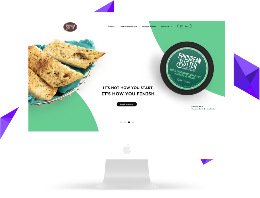
Our goal
One day in Colorado, the founders of Epicurean Butter – John and Janey Hubschman – came up with a great idea. They decided to share their experience in gastronomy and help people to cook restaurant-quality dishes at home with no additional efforts. That is how Epicurean Butter was born. Since 2004 the Epicurean Butter has served flavoured butter for different meals for home chefs. The goal of our team was providing clear front end, quality UI/UX experience, and 3D models of the dishes to show the best traditions of the Epicurean Butter. In our opinion, the goal was reached – what do you think about the result of the work?
One of the main parts of the Epicurean Butter website is the Recipe page. In a clear way it presents the meals which home chefs can prepare by themselves with the use of the offered butters to achieve the results in the form of restaurant dishes.
Our team prepared a clear layout, buttons and icons. Now home chefs can see the whole recipe on one page, preparation or cooking time, and the level of difficulty.
We responded to all requests
01
Clear layout
02
Modern design
03
Sections
04
Easy purchase
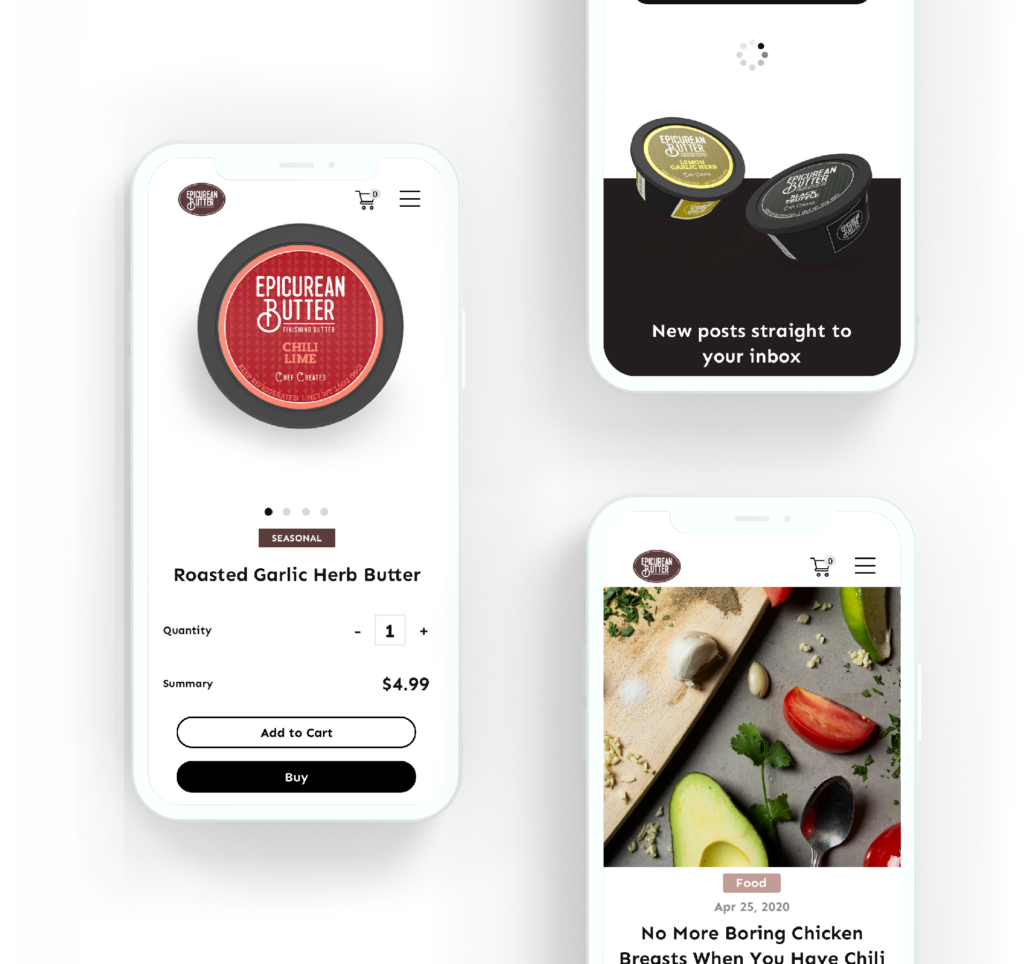
How would your product look with such a front end?
The page of Epicurean Butter uses the Responsive Web Design guidelines, so it is attractive and usable on various devices: desktop computers, smartphones, tablets.
The rounded corners of the buttons attach elegance to the whole appearance of the page, both on mobile and desktop devices.
The menu is intuitive and simple: you can choose one of the four sections: Products, Recipes, Culinary Services or Company.
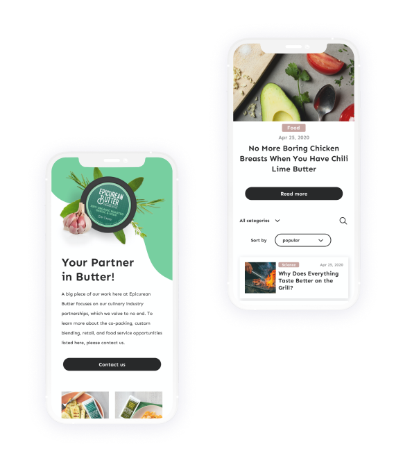
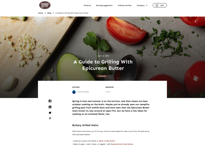
The design allows easy access to the Card, so the process of purchasing is truly simple and pleasant for the clients of Epicurean Butter.
A product box has a direct purchase button. These elements are created for each recipe card for fast adding specific butter to the Cart.
Solution
The clear layout of the Epicurean Butter website adjusts to the browser window, which makes the site valuable from the business point of view. The right position, size and colour of buttons and icons showed good results for our clients.
One of the most important parts of the website is the Recipe page where the users can find inspiration to prepare fine meals. Attractive 2D and 3D models of the meals, which could be prepared with the use of the Epicurean Butter products, encourage customers to cook it by themselves and try the kinds of butter. The four sections of the website facilitate the access to the needed part.
Our Partner said

Each stage of the project is done thoroughly and the client gets much more than they expected.
Their graphic designer was able to take our concept and quickly visualize it accurately.
It was effective cooperation, the whole management process was on the Liki side. They were responsive and flexible.
I truly love working with people from my team. We’re all passionated about every project we touch.
Their speed, knowledge, and professionalism are the keys to a successful ongoing partnership.
They’re always improving their work and project management.
Their engineers had good communication skills and engineering skills. They did well on taking tasks.
